
Home loan fintech-pt2
Home loan fintech : UI and illustration
she’s a home loan wrecker
As an initial offering to the market we wanted to present a strong brand presence that would appeal to variety of demographics that were currently disengaged with their home loans and home loan providers (often banks). Through customer research we found that nearly all borrowers (93 per cent) wanted to pay off their home loans faster, but fewer than 1 in 5 believed their lenders wanted them to succeed.
The fintech digital platform aims to create customer efficiencies with technology – avoiding the costs of bankers, branches and overheads – so that they are able to pass on the savings to customers via lower interest rates.
Tools
Sketch, Invision, Illustrator
My ROLE
I worked closely with the Design Director, UX designers, marketing and engineering teams to develop and design pages for the public website and home loan website application. During my time at the Home Loan fintech I developed components, iconography and interactions that reflected the brand principles and also ensured a delightful and seamless user experience for customers arriving at the public website through to applying for a home loan on the responsive website application.
design
Visual iconography
For the web application and website we wanted to use iconography that imbued the brand’s cheeky and bold personality. To achieve this I designed a series of visual icons and spot illustrations. Unlike system icons, the visual icons could be a bit more explorative in their design while still aiding usability. The designs themselves are made up of a simple palette with a contrasting pop of colour and slight offset of fills to create some interest.

Left to right - Image 1: Visual icons provide context for the different text blocks, Image 2 and 3: Spot illustrations add a playful element to the screen and also animate upon user making a selection.
Responsive web pages
The design of the web application is mobile first in approach to ensure that content is focused and that each step of the application process is easily understood.
From initial discovery research we found that a majority of customers would use their smart phones to fill out the home loan application. Since the website has gone live, analytics have validated our research that a high percentage of customers are using their mobile phone to fill out the application.
As a result of designing mobile first, we were able to develop a strong MVP of the web application that could scale to different screen sizes and in the future look to build upon the additional real estate of larger screens. There have been some challenges in adding in more complexity to the larger screen sizes and currently the desktop experience is still in development.
During my time at the fintech, I designed a range of pages that included responsive menus and navigation and developed a range of ‘templates’ that could be used across different pages of the website.
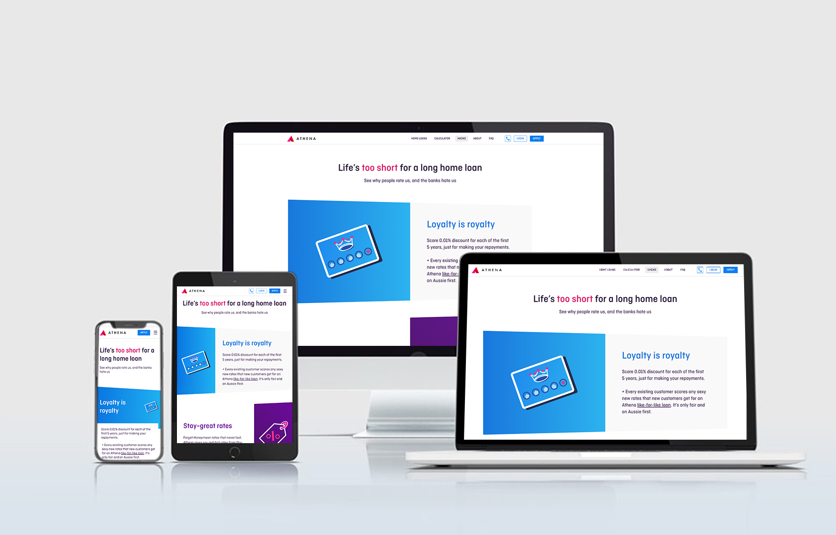
Example of a section of the home page outlining the different value propositions offered by the fintech. I designed the illustrations and page layout and worked with the engineers to set up break points in order ensure that the page grid would display effectively across varying screen sizes. The value propositions also known as ‘Proof points’ animate onto the screen as the user scrolls down the page.


