
Upload Once
Upload Once
Upload Once is an online cloud service that helps organisations remove friction from their sales process. Upload Once aims to lower the process and hurdles in order to stop people being unnecessarily excluded from services. They came to us to Improve the website so it is intuitive and the onboarding process is seamless.
CHALLENGES
To make services accessible for everyone we need to make it easier for files to be managed. Currently, people use a variety of platforms (e.g Google Drive and Dropbox) to manage personal information. These self managed online cloud services require a level of organisation and file management that not everyone possesses.
DURATION
1 week
PROJECT TOOLS
Sketch, InVision, Powerpoint
TEAM
Sam Stanley, Steve King and Suely Lu
THE GOAL
How can we make accessing services a seamless and engaging experience for everyone?
1. DISCOVERY AND RESEARCH
road map

research methods

KEY INSIGHTS
From our research we were able to validate our initial assumptions about the issues of the website. We were also able to develop a user story and persona to help define the needs of the customer.
- Site not intuitive - Without the founder's training, users mentioned they would probably not understand how to use the website. Users also mentioned that the navigation was clunky and required quite a bit of prior understanding.
- Use on mobile phone - In general people wanted to access the website via the computer desktop but used their phone to take photos of documents to upload rather than scan.
Founder's training is a crucial part of the onboarding experience
People are interested in the ‘automated’ ability
2. DEFINE
BRIEF REDEFINED
We want the website to be accessible and also keep current customers happy. That means focusing on how we can improve the experience on the website for those that do not necessarily have barriers but want a way to streamline their current processes. We should first focus on getting the website to work intuitively so the next stage can be to reach a wider audience.
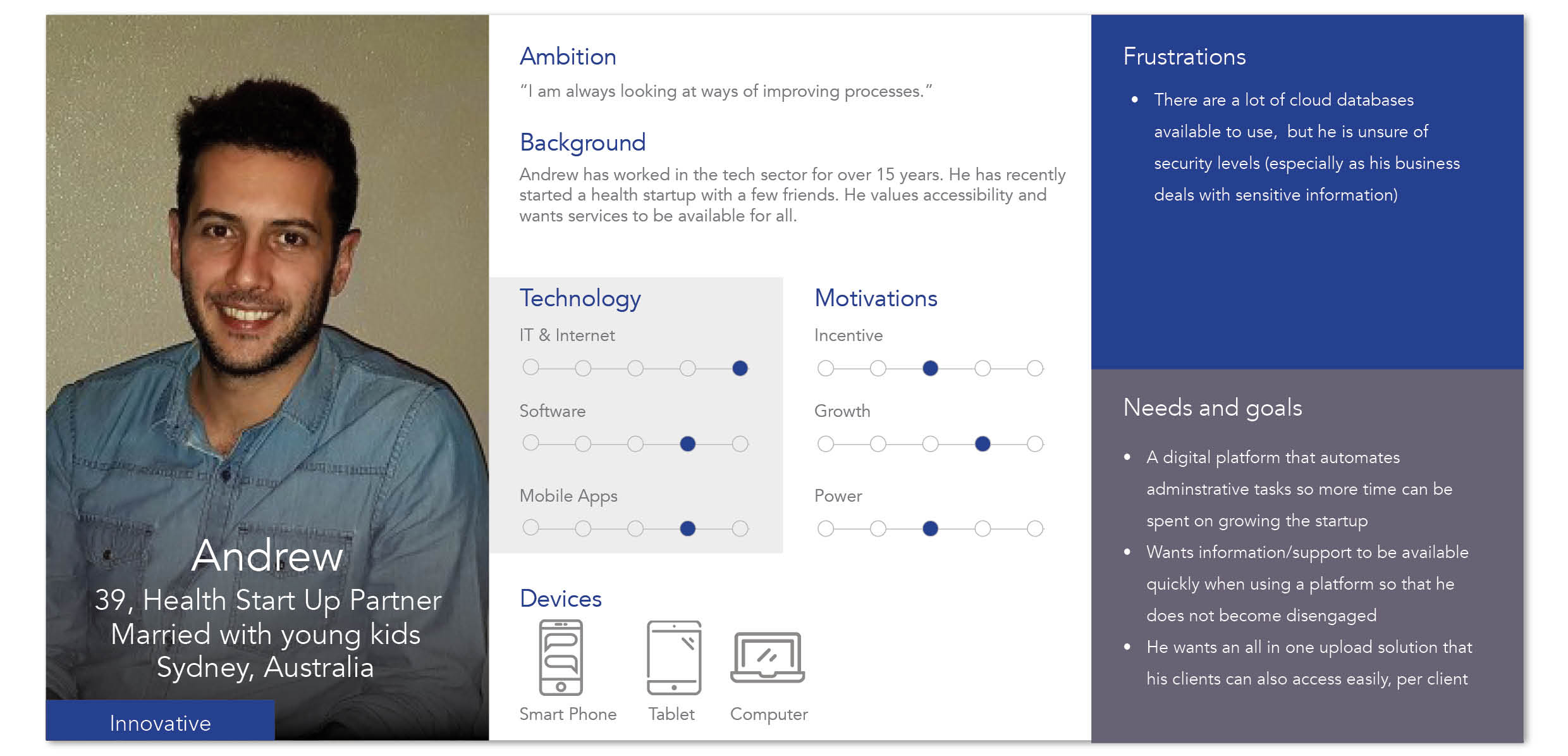
PERSONA
USER JOURNEY

3. DESIGN
Based on our research we decided to focus on some key areas that we would test with new users.
STAGE 1 RECOMMENDATIONS
- Reduce navigation options
Improve Document Requests flow - Users instinctively wanted to access clients from ‘Address Book’ or be able to search for them instead of going through Document Requests.
Adding Hint Tips throughout website - So that additional information is easily accessible
Further usability testing
PROTOTYPE

4. RESULTS
At the end of the week we presented the prototype and our findings from the usability testing. We also made recommendations on future areas to investigate and suggested next stages.
TAKEAWAYS
For this project we spent quite a bit of time interviewing current users of Upload Once to understand their needs and objectives. We found that the current users were not aligned with the ideal users the business had presented in our initial briefing. The current users were quite familiar with using software and web application whereas the business wanted to focus on providing access to services to those that had language or software skill barriers. In order to provide value to the business and current users we had to focus on improving the overall usability before we could look at accessibility.
KEY LEARNINGS
It is important to spend the time understanding what steps or processes can be taken away to achieve the same goal.
Engaging users is about making each step of the process meaningful
Learning curves are expected, however, it can be helpful to guide users along the way
The Upload Once team has taken our feedback onboard and handed over to their development team to implement some of the changes immediately.


